NalaGenetics Homepage Revamp
Role
Lead Product Designer, Visual Strategy, Design Direction
Timeline
Q1 2025
Result
The design has been implemented by engineering in Q2 2025 and Stakeholders reported improved clarity during sales demos
Lead Product Designer, Visual Strategy, Design Direction
Q1 2025
The design has been implemented by engineering in Q2 2025 and Stakeholders reported improved clarity during sales demos
The existing homepage lacked brand alignment and failed to guide users effectively toward purchasing DNA test products. It presented too much information with weak content hierarchy, little emotional engagement, lack of visual aesthetic and minimalism design and confusing product categorization—resulting in poor conversions and user drop-off.
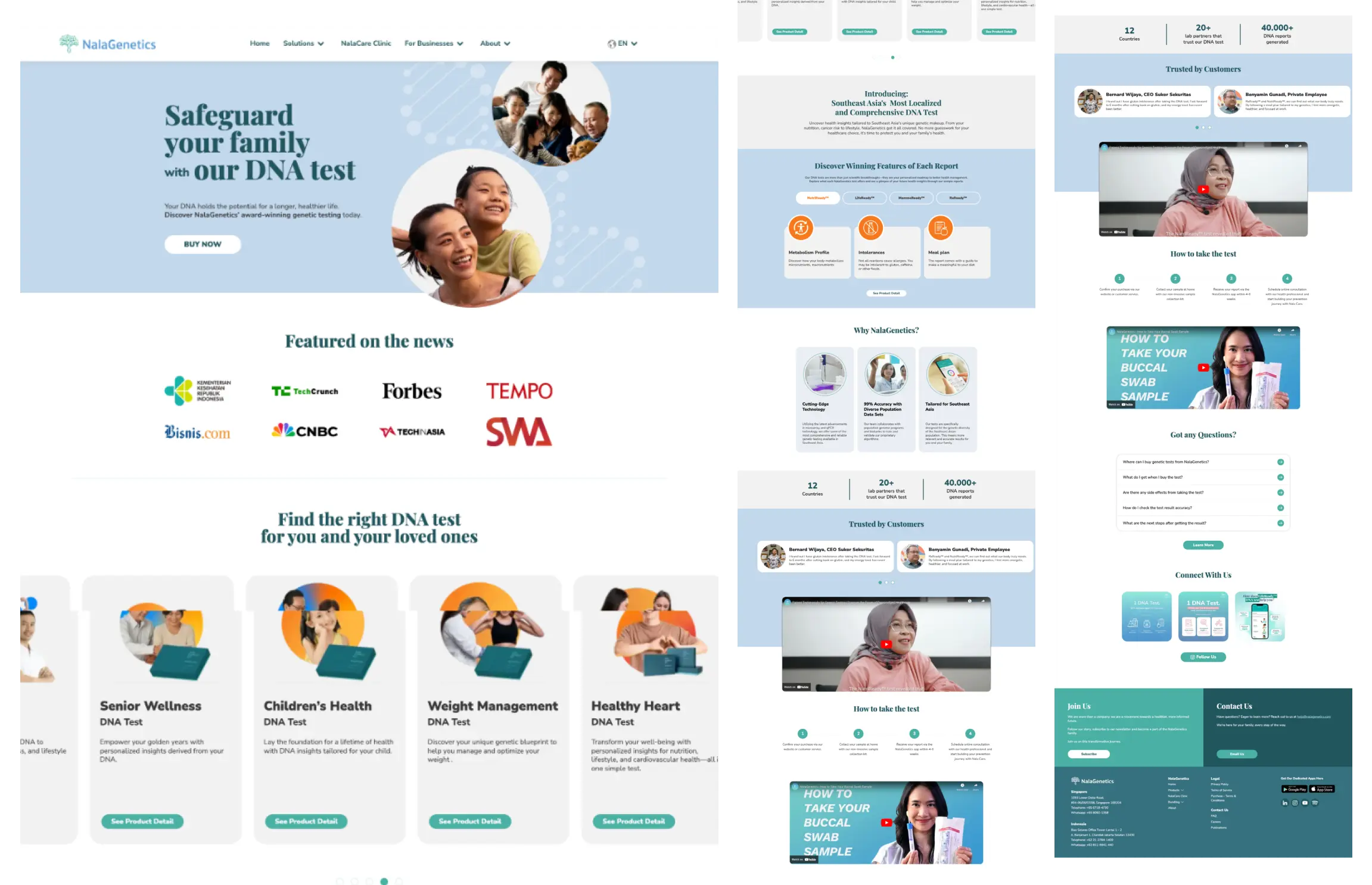
Past Design of Homepage
I audited the current homepage against usability heuristics (e.g., consistency and standard , aesthetic and minimalism design, user control and freedom). Key findings included smaller CTAs, incosistency card, and a lack of visual aesthetic and minimalism design. There was no clear path for a first-time visitor to explore, understand, and purchase a DNA test confidently.
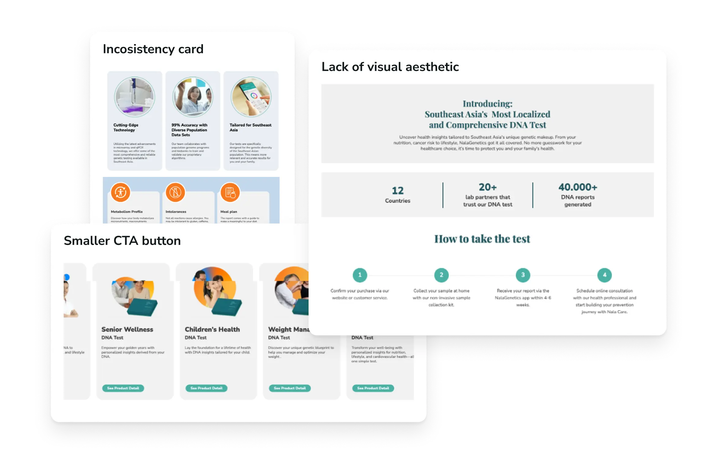
Heuristic Point
I reviewed competitor websites across Southeast Asia and globally, including both direct DNA testing brands and adjacent health tech services.
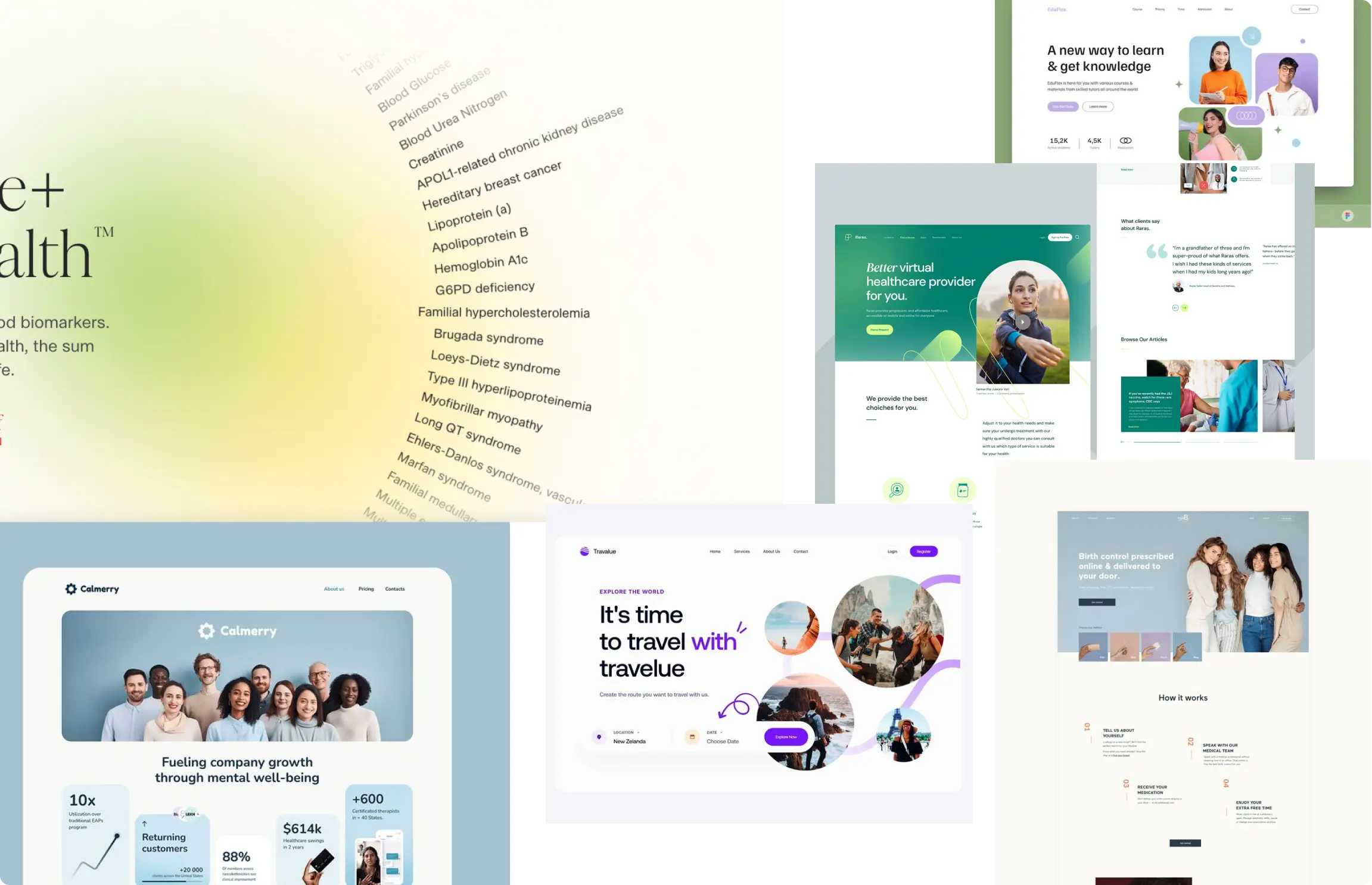
Competitive Analysis from another websites
This analysis helped uncover:
Common design patterns in product categorization
Effective storytelling techniques for trust-building
Building Nala’s branding to match and be consistent
From this mixed-method discovery phase, I distilled four major pain points:
Product Confusion:
Found it hard to determine which DNA test was relevant to them. The previous homepage listed products without context, categories, or guided pathways—causing decision paralysis and reducing purchase confidence.
Lack of Emotional Connection:
The old design relied on generic stock imagery and didn’t tell a compelling story. Since genetic testing is personal and often family-driven, the experience lacked warmth and relatability, making it feel overly clinical.
Inconsistent Brand Experience:
The homepage did not reflect Nala’s updated brand identity—both visually and tonally. Elements like color usage, typography, iconography, and messaging were either outdated or inconsistent with other touchpoints (ads, product packaging, social media), creating a fragmented user experience and reducing trust.
No Clear Differentiation or Localization:
Nala’s unique value—being tailored for Southeast Asian genetics—was not communicated clearly. Users couldn’t easily understand why they should choose Nala over more established global brands.
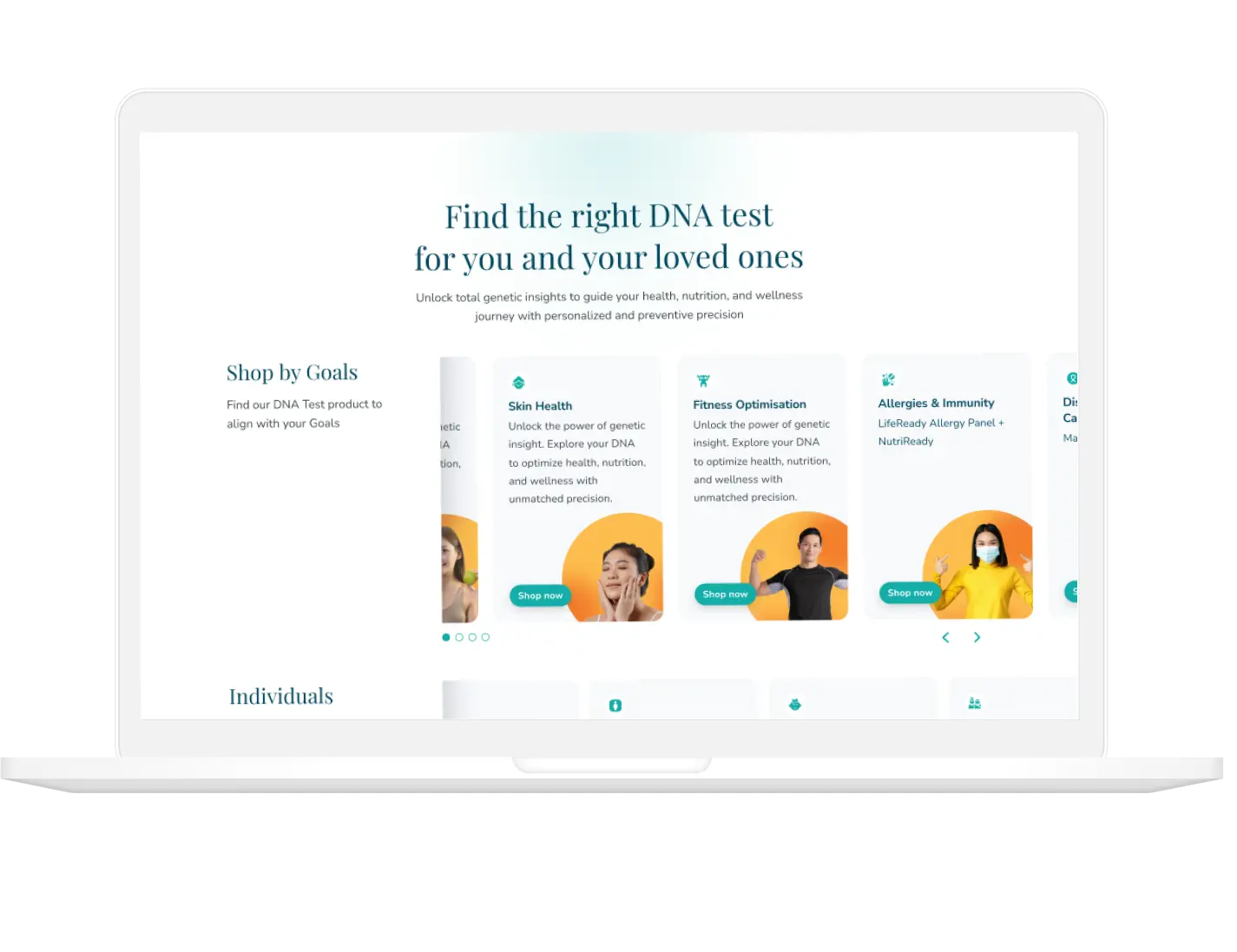
Product Section
Design Response:
Restructured the product section by grouping tests into intuitive categories like “Senior Wellness,” “Children’s Health”, “Weight Management”, and etc.
Added icons, short descriptors, and comparison-friendly cards to guide users in choosing a product.
Introduced supportive CTAs like “Learn More” and “Who is this for?” to help users self-identify.
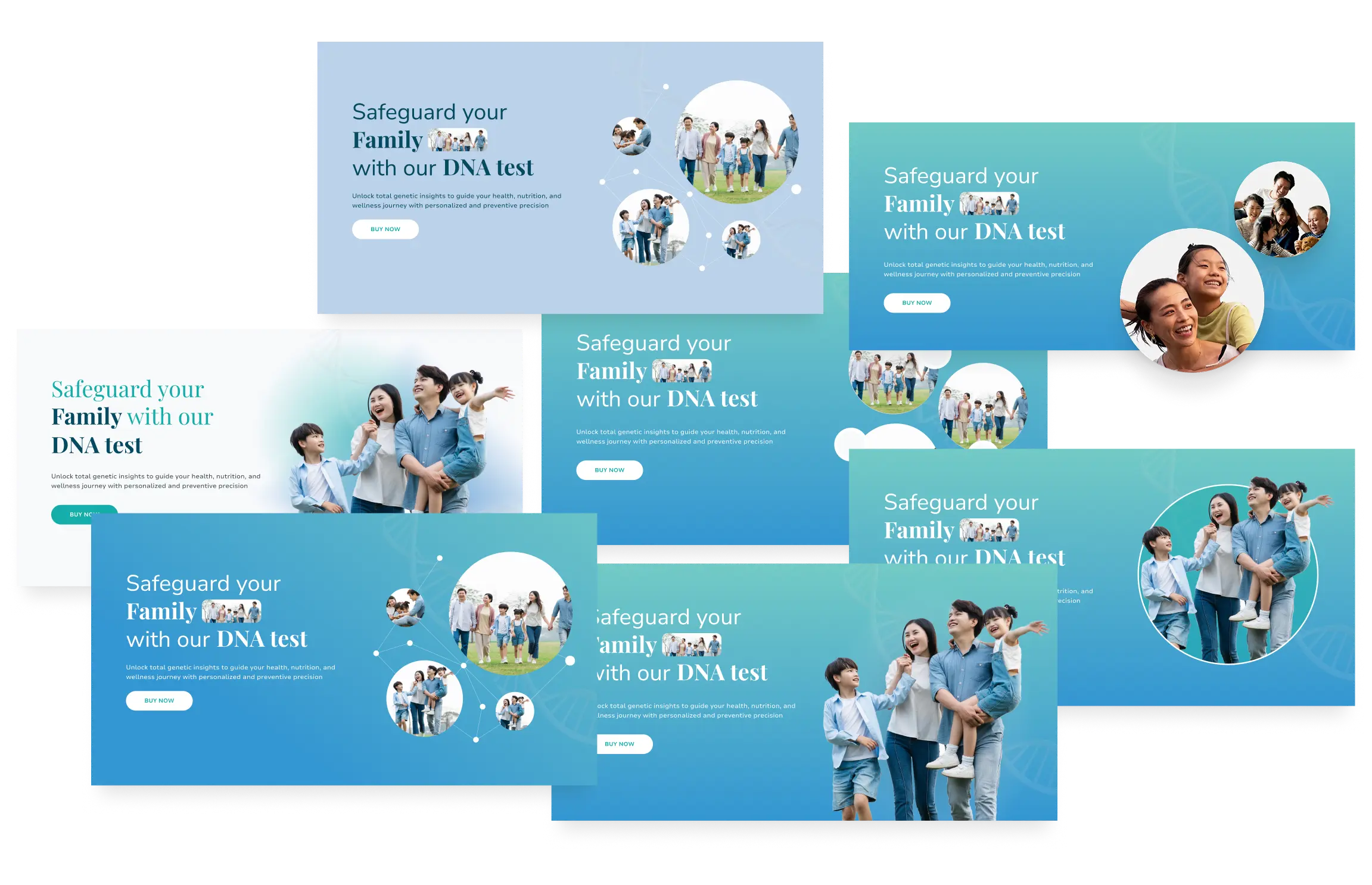
Hero Section Exploration
Design Response:
Reimagined the hero section with relatable human-centered imagery (e.g., diverse families, children, seniors)
Used a warm and empathetic tone of voice in headlines and descriptions
Hero Section Exploration
Design Response:
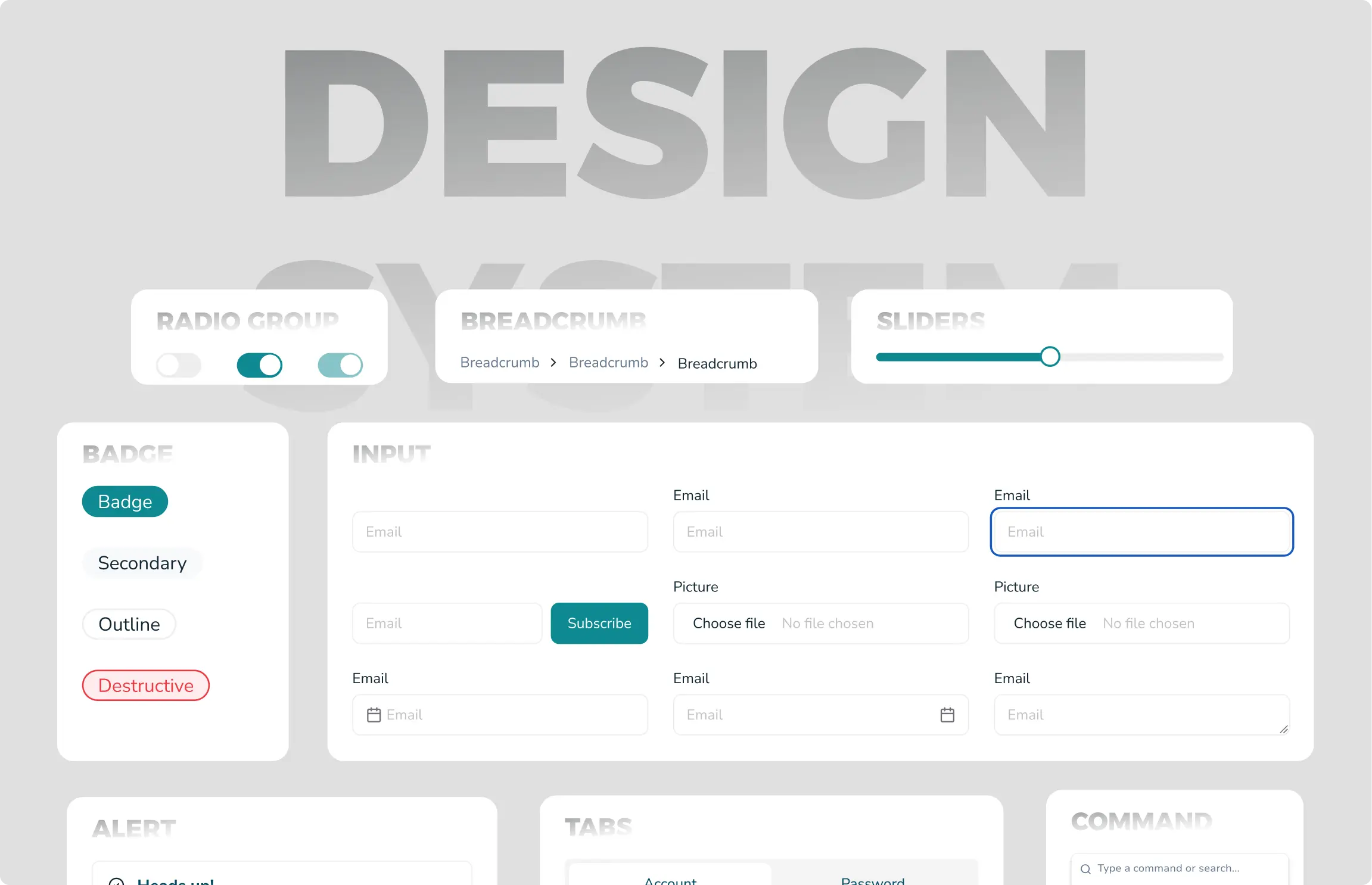
Applied Nala’s updated brand guidelines across the homepage (colors, typography, icon style, spacing)
Created a modular design system in Figma to ensure consistency in spacing, buttons, and cards
Collaborated with the brand and marketing teams to align visuals and messaging
.webp)
Design Exploration
Design Response:
Created a dedicated section explaining “Why Choose Nala?” and highlighting regional DNA insights
Used iconography and plain language to explain Nala’s competitive advantages
Localized the visual identity with Southeast Asian imagery and image stock assets

Design Hero Section - Before
Before:
Lacked a clear visual hierarchy
Generic imagery not aligned with family or personal health focus
Weak call-to-action positioning
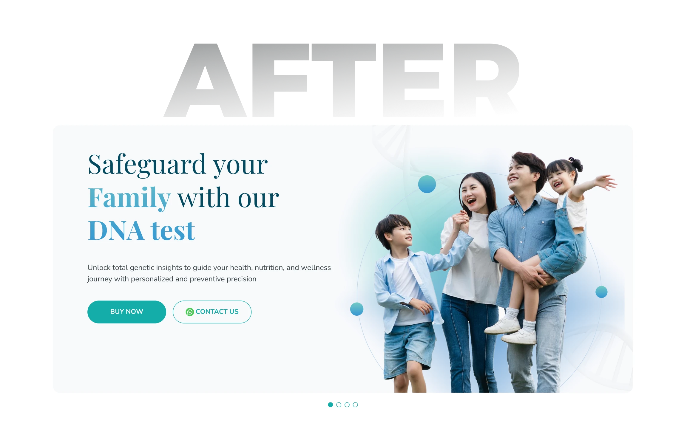
Design Hero Section - After
After:
Strong emotional imagery (family-oriented) that builds trust
Clear value proposition with bold headline and subtext
CTA buttons are more prominent and action-oriented
Integrated CMS (Content Management System) support so the marketing team can update hero content (e.g., banners, offers, messages) without needing developer support

Media Section - Before
Before:
Basic logos with no context
Bad alignment, padding, and visual rhythm
No animations or movement, resulting in low engagement

Media Section - After
After:
Clickable logo to enhance credibility
Redesigned section with better alignment, padding, and visual rhythm
Added horizontal scrolling animation to showcase multiple logos in a compact
Improved visibility and engagement without overwhelming the layout
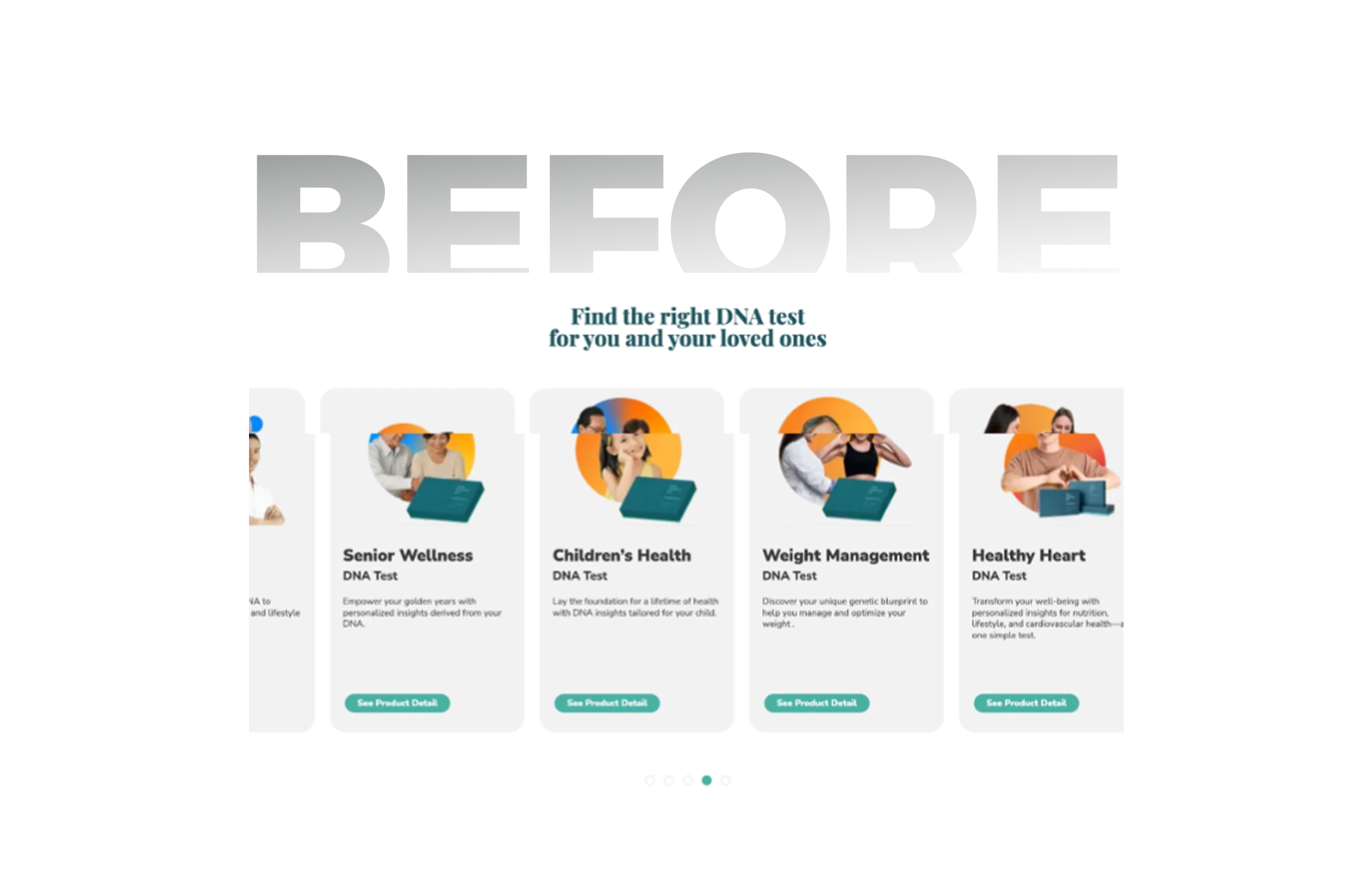
Product Section - Before
Before:
Product offerings felt flat and confusing
No grouping by audience or needs
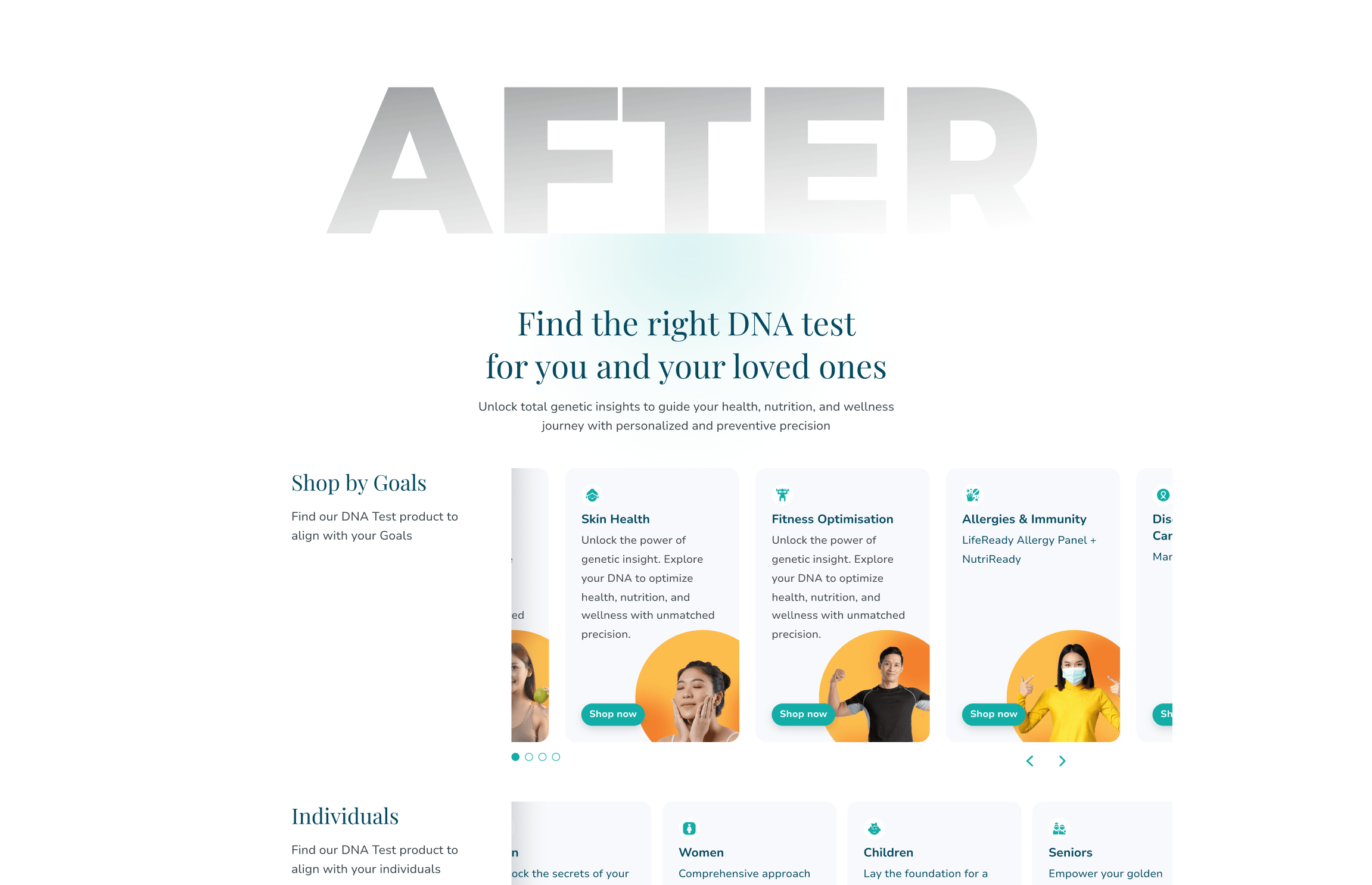
Media Section - After
After:
Categorized product cards (e.g., for seniors, children, weight)
Visual aids and concise descriptions help guide decision-making
Scannable layout and consistent card design
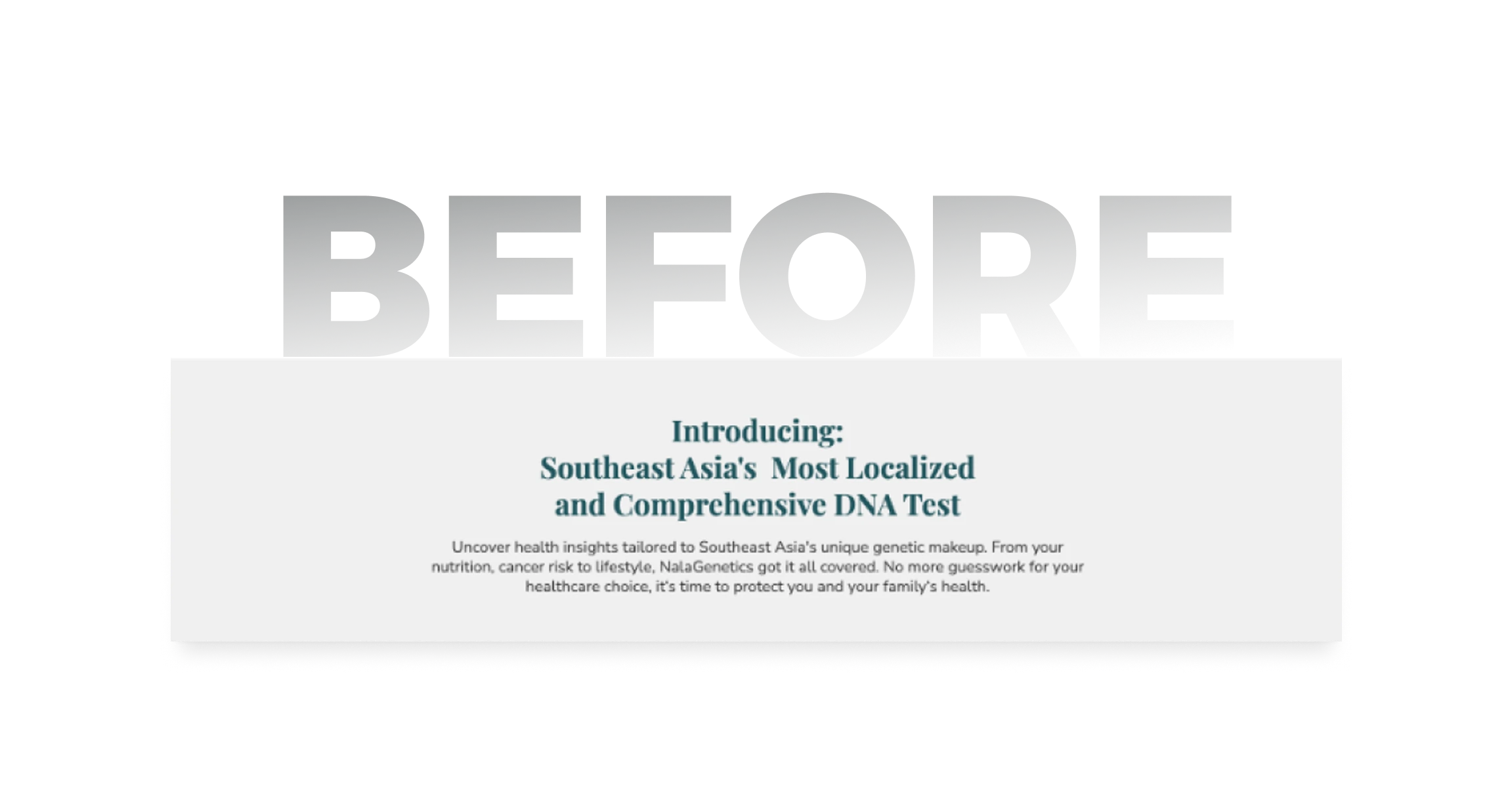
Localized DNA Test Section - Before
Before:
Static layout with no visual reference to explain the section
Lacked engagement or visual cues to encourage reading
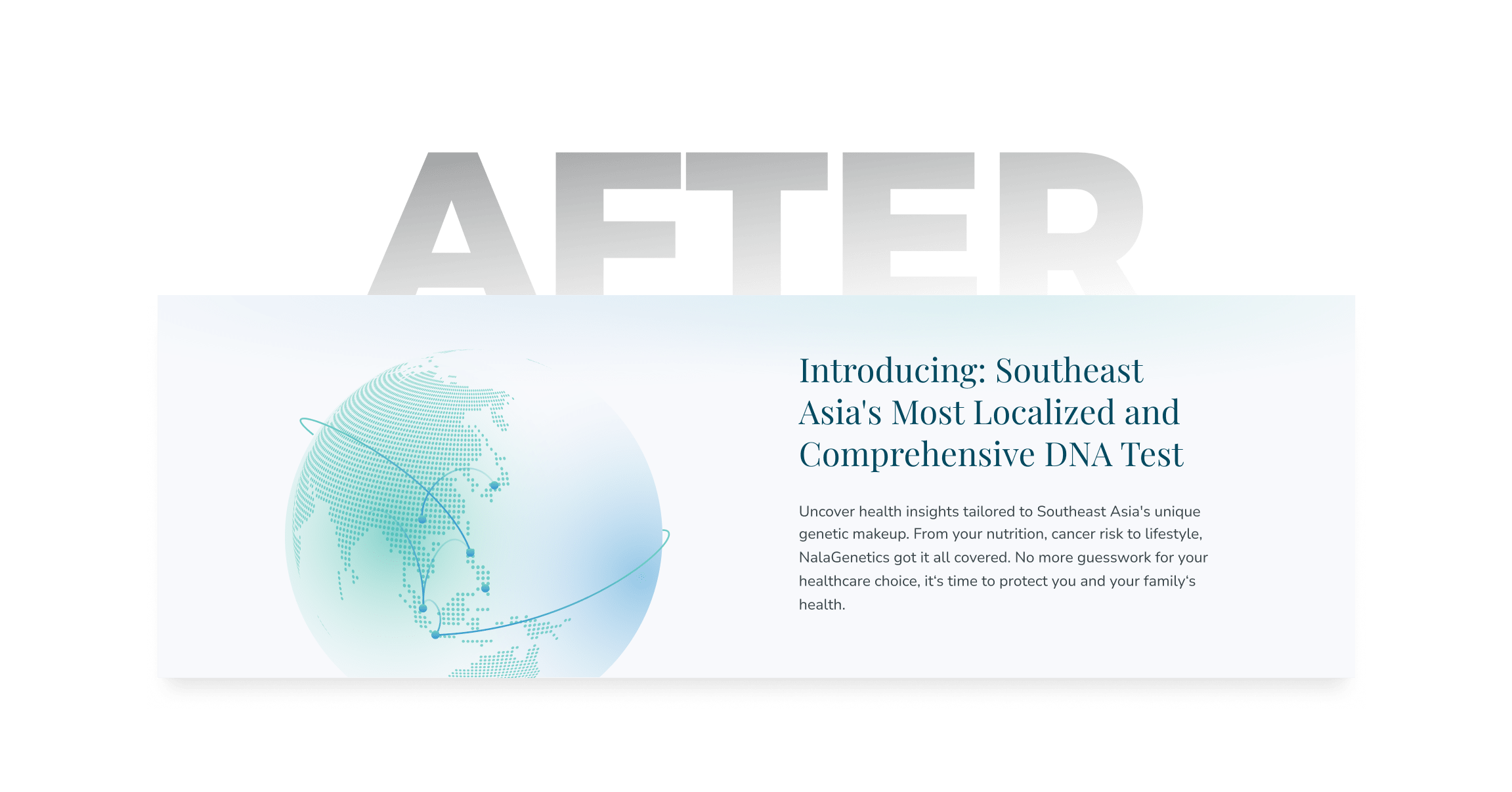
Localized DNA Test Section - After
After:
Added a visual of the Southeast Asia globe to contextualize the content and draw attention
Incorporated Nala's brand colors to maintain visual consistency and reinforce identity
How to take a test - Before
Before:
Only numbers were used for the instructions, with no visual support
Lacked engagement or visual elements to guide the user
Localized DNA Test Section - After
After:
Added step-by-step visual illustrations to enhance clarity and engagement
Simplified and structured instructions to improve understanding
Highlights of the New Design:
Clear visual hierarchy with hero messaging tailored to family-based buyers
Structured product cards with categories like “Senior Wellness” and “Children’s Health”
Interactive FAQ and explainer video embedded to educate and reduce purchase hesitation
Southeast Asia–focused localization through images and content tone
Clear CTA buttons and simplified user journey to purchase
Consistent brand experience across all homepage elements—colors, typography, icons, and tone—aligned with Nala’s updated identity
Quantitative:
(To be updated — website just launched)
Qualitative:
Positive feedback from marketing team noting the design feels clean and consistent with the Nala brand
Internal teams appreciated the clearer categorization and visual flow