NalaGenetics Logo

Making Genetic Reports Simple & Actionable

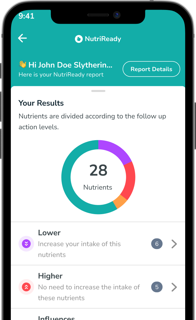
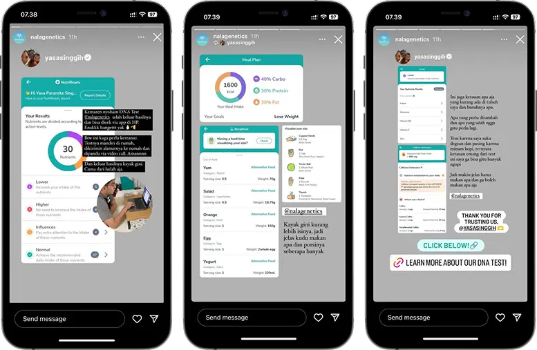
NalaGenetics' NutriReady service provides users with personalized nutrition insights derived from their DNA. However, these results are delivered in a dense, 50+ page PDF report, creating a significant usability barrier.

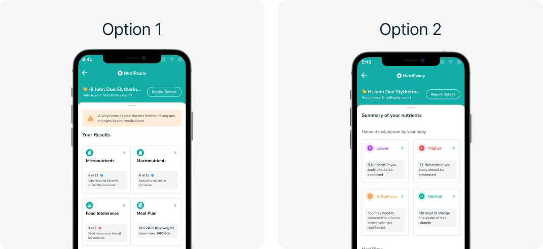
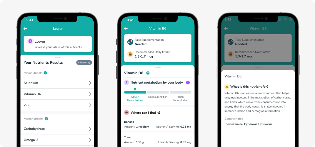
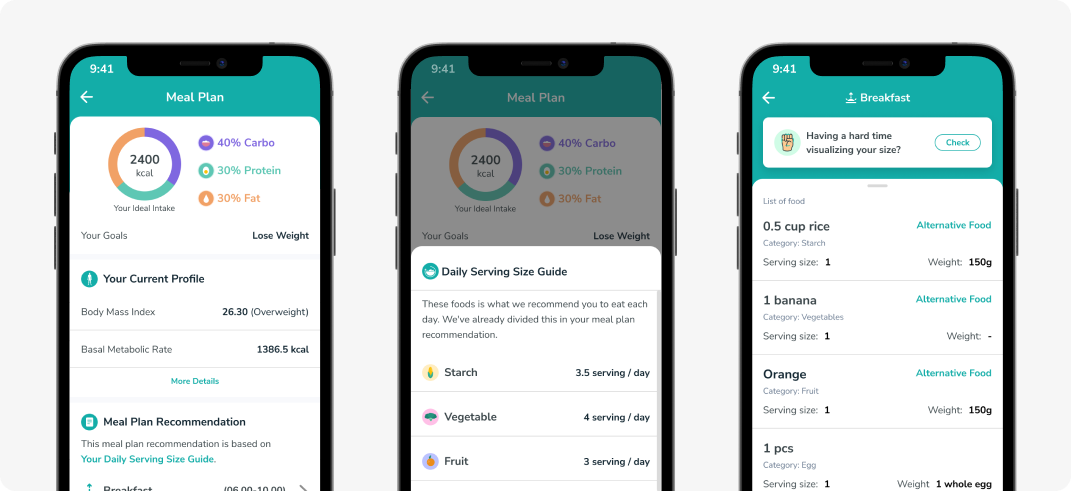
As the Product Designer, I led the design of a mobile application, collaborating with product and engineering teams and validating the solution through usability testing. The final app transforms the cumbersome static report into an interactive, searchable experience, empowering users to easily access and act on their unique genetic information.

Final App Screenshot
Role:
Product Designer (Sole)
Final App Screenshot
Collaboration with:
Product Managers and Software engineer
Final App Screenshot
Role:
Q4 2023
Final App Screenshot
icon what the challenge

WHAT WAS THE PROBLEM

user challenge

User Challenges

  • Overwhelming & Unreadable:
    Navigating the dense 50+ page document was overwhelming and required tedious manual searching to find key data.
  • Zero Functionality:
    The static format offered no interactive. Users could not sort, filter, or compare their own data, making personal analysis impossible.
  • Inaccessible Design:
    The PDF was inaccessible to users with disabilities, as screen readers could not interpret the content, effectively excluding a key user segment.
user challenge

Business Challenges

  • High Friction & Abandonment:
    Large file sizes and a poor user experience created high friction, leading to low engagement and a significant risk of product abandonment.
  • Brand & Support Strain:
    Widespread compatibility issues created a broken, inconsistent experience that damaged brand trust and increased customer support costs.
icon what the challenge

USER RESEARCH & CORE INSIGHT

I conducted user research to anchor the project in user needs.
Objectives & Method
  • Objectives
    To understand user behaviors with the current PDF report and identify the most high-value information to prioritize in a mobile app.
  • Method
    1-on-1 interviews with existing NalaGenetics customers.
user challenge

Actionable Insights

  • What is the user goals?
    Users' primary goal is to find a nutrient summary that directly informs which supplements they should take. They value actionable recommendations far more than the exhaustive raw data.
  • How we structurized the IA (Information Architecture)
    The 50+ page PDF was consistently described as "overwhelming." Users reported they often didn't know where to start, leading them to ignore or miss critical information.
icon what the challenge

WHAT WAS WE MADE

How to make a great layout for the Nutrient Summary

  • Problem: Users needed a simple, scannable summary of their complex 50+ page genetic report.
  • Solution: Explored two dashboard concepts: one organized by scientific categories (e.g., Micronutrients) and another by actionable insights (e.g., Increase/Decrease).
  • Result: Team feedback confirmed the actionable insights approach was best but required UI refinements for screen space and clarity, which directly guided the next design iteration.

The Nutrient Detail Flow

  • Problem: In the PDF, actionable details like dosage and food sources were disconnected from the user's results, leaving them with data but no clear next steps.
  • Solution: Designed a "drill-down" user flow that reveals information in layers—moving from a summary list to actionable advice, and finally to simple explanations.
  • Result: This layered design prevents information overload. It empowers users by directly connecting their personal health data to clear, confident actions.

The Meal Plan Flow

  • Problem: Users knew their high-level nutritional targets but struggled to translate that data into actual daily meals. They lacked a practical plan and found concepts like "serving size" to be abstract and confusing.
  • Solution: I designed an integrated meal plan flow that translates complex data into simple, daily actions. The flow sets clear goals (calories, macros), provides a daily serving size guide, and offers concrete meal examples with "Alternative Food" options for flexibility.
  • Result: This feature bridges the critical gap between "knowing" and "doing". It empowers users to build sustainable, healthy eating habits by providing a clear, actionable plan that fits their real life.
icon what the challenge

ITTERATION THAT SHAPPED THE FINAL PRODUCT

Homepage of the report: Making the Nutrients Summary Clear

Here are some changes made based on usability testing:
  • Reduced the size the nutrient diagram compared to the previous version.
  • Changed the result label color in each list to be more consistent with the previous report.
  • Combined the Macronutrient section and meal plan into one section, as they are related.
  • Added a 'More Details' button on the Meal Plan Card to inform users that the card is clickable, instead of relying on text alone.
Result: A more intuitive and scannable interface that led to higher task success rates and user satisfaction in follow-up validation sessions.
icon what the challenge

PROJECT IMPACT & RECOGNITION

Here is a summary of the positive impact and validation the new design has received.
user challenge
INCREASED USER CLARITY
“Now I know what to add & reduce”
Users reported finally understanding their body's needs.
user challenge
EMPOWERED HEALTHY EATING
“I know my portion sizes now”
Gave users the confidence to build a flexible, varied diet.
user challenge
INDUSTRY RECOGNITION
Zurich Competition
The product was successfully presented at a global innovation competition.
user challenge
POSITIVE SOCIAL FEEDBACK
“Thank You, NalaGenetics!”
Received enthusiastic public praise from customers on social media.
  • design exploration 1
  • design exploration 2
  • design exploration 1
  • design exploration 2
  • design exploration 1
  • design exploration 2
icon what the challenge

KEY LEARNINGS

icon what the challenge
Feedback Drives Clarity

Iteration is essential, but it's most powerful when guided by evidence. Direct user feedback from our usability testing was the catalyst for crucial UI refinements that turned a good design into an intuitive one.

icon what the challenge
From Complex Data to Clear Action

This project proved that raw data, like a 50-page report, isn't enough. A user-centered interface is the bridge that turns complex information into an accessible, understandable, and ultimately actionable experience for the user.